Revamping event Booking experience

- Role: Digital Experience Manager
- Tools: Figma, Adobe Family
- I analyzed multiple leading event and concert ticket booking platforms to identify industry best practices and user pain points.
- My goal was to optimize the user journey—from discovery to post-purchase—on a ticket booking platform, ensuring a seamless, secure, and enjoyable experience.
- This project demonstrates my ability to conduct thorough UX research, synthesize insights, and translate them into actionable design improvements.
Problem Statement
Ticket booking landscape is fragmented, offering outdated experiences, cumbersome navigation, and limited transparency—resulting in user frustration and lost sales.
Business Goals
- Increase conversion rates by streamlining the booking process.
- Improve user satisfaction and trust in the platform.
- Reduce drop-off rates at key stages (seat selection, payment).
- Enhance cross-selling of related services (parking, meals).
User Needs / Pain points
- Complex seat selection: Users found it difficult to compare seating options due to poor mapping and lack of filters.
- Confusing pricing information: Users struggled with unclear pricing, additional fees, and unclear discount offers.
- Long and confusing checkouts: The booking process involved too many steps, leading to frustration and abandoned purchases.
- Poor mobile experience: Despite the high mobile traffic, the site was not optimized for mobile users, causing navigation difficulties and slow load times.
- Limited post-purchase management: Users had difficulty managing their tickets after purchase, especially for reselling or transferring tickets.
Challenges
- Usability issues: Complex workflows, unclear pricing, and confusing seat selection.
- Security concerns: Rising ticket fraud and lack of trust in digital ticketing.
- Low engagement: Poor cross-selling and upselling opportunities.
Specific KPIs
- Booking completion rate (target: increase by 15%)
- Drop-off rate at seat selection (target: reduce by 20%)
- Cross-sell conversion rate (target: increase by 10%)
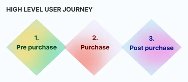
- Pre-Purchase: Event search, price comparison, seat selection.
- Purchase: Checkout and payment flow.
- Post-Purchase: Ticket transfers, cancellations, and support.
-
In this phase my primary goal was to design a seamless, user-friendly ticketing experience across multiple touch points while ensuring legal compliance, technical feasibility, business viability, and usability.
Design Approach
- Feasibility: Aligned with current tech & infrastructure.
- Business Viability: Budget-friendly & sustainable.
- User Usability: Intuitive & accessible for all users.
(The "sweet spot" where these three overlap guided the final design.)

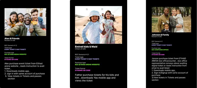
Scenario-Based User Journeys
- Online purchases.
- Call center bookings.
- Walk-in counter transactions.
Designed for multiple permutations to avoid friction.

Creating Marketing & Educational Materials
Digital & physical guides to educate users on redemption. Strategic placement in high-traffic website areas (based on analytics).
Used banners & campaigns on top-viewed pages to maximize visibility & adoption.


Designing for Multiple Mediums and Edge Cases
- Website (B2C purchases) → Mobile App → Email → Turnstiles.
- Unified experience with flexibility for different user preferences.

-
In this phase, I developed and tested multiple design directions—from low to high-fidelity prototypes—while formulating hypotheses to guide decision-making. Close collaboration with cross-functional teams and stakeholders enabled rapid validation and iterative refinement of the user experience.
Low-fidelity to High-fidelity
Based on a thorough competitor analysis of industry leaders like Ticketmaster, AXS, StubHub, and SeatGeek, I developed wireframes ranging from low-fidelity to high-fidelity. Best practices were incorporated to ensure a user-friendly experience.


End to End Completion
- I mapped the entire user journey from ticket purchase to successful event entry, capturing all possible scenarios and edge cases to ensure a seamless experience.
- Despite budget constraints, I conducted testing within our campus, involving colleagues who are tech and non-tech-savvy. This iterative process allowed us to gather valuable feedback and refine the prototypes.


Design Tools & Deliverables
- Primary Tool: Figma (wireframes, high-fidelity designs, prototypes).
- Supporting Tools: Adobe Suite.
- Design Delivery: Shared in flexible formats for cross-team collaboration.

Delivery to Development
- Provided annotated designs with detailed notes on interactions, animations, and logic.
- Facilitated smooth handoff by clarifying design intent and technical requirements.
Accessibility & Multilingual Support
- Basic WCAG compliance (contrast, text sizing) despite limited company focus.
- Dual-language (RTL/LTR) support with adaptable layouts for text expansion.
-
Business Impact
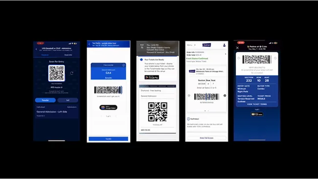
- Zero Fraud Achieved: Replaced static tickets with a secure digital system via mobile app login, eliminating fraud during the pilot phase.
- End-to-End Revamp: Redesigned the entire booking flow across website and mobile, aligning with global UX best practices to fix usability gaps and streamline navigation.
- User Education & Marketing: Launched clear redemption guides across website, emails, PDFs, banners, and mobile app, easing the transition and improving adoption.
- Mobile App Upgrade: Integrated digital ticketing for events, theme parks, and activities into the app with smoother purchase and management flows.
- Advanced Ticket Features: Added in-app ticket transfer, cancellation, queuing during demand spikes, and bot detection to prevent resale abuse.
- Revenue Enablement: Designed cross-sell and upsell flows for meals, parking, and other services—expanding monetization potential across the island.
- B2B Partner Adoption: Enabled major B2B partners to shift to digital tickets despite having separate user models, improving consistency and reducing fraud.

User Impact
- Security with Convenience: Maintained smooth user experience while introducing app-based redemption for fraud prevention.
- Frictionless Adoption: Proactive education minimized resistance; users quickly adapted to the new flow with clear guidance.
- Increased Trust: Secure ticketing model improved user confidence in digital channels.
- Smarter Purchase Journey: Enhanced flows and features led to better engagement, easier ticket management, and higher satisfaction.
Key Results
Below is based on the pilot phase and different factors affecting the below data points:
- +10% Booking Completion Rate
- −12% Drop-off at Seat Selection
- +5% Cross-sell Conversion Rate
-

Key Lessons Learned
This ticketing revamp journey offered critical insights across usability, security, and user behavior:
- Security vs. Usability: Introducing mobile sign-in and digital ticketing improved security but required careful UX planning. Clear communication and proactive education helped users adapt without friction, proving that trust is built through transparency.
- Power of User Education: In-app guidance, marketing materials, and on-premise banners played a key role in adoption. Educating users early ensured smoother onboarding and fewer support issues.
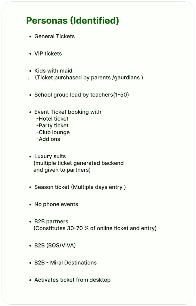
- Inclusive Design is Essential: Designing for both tech-savvy and non-tech-savvy users (with digital, Face ID, and paper ticket options) reinforced the need for adaptable systems that serve diverse audiences.
- Iterative & Collaborative Design: Quick prototyping and feedback loops with cross-functional teams helped refine the product early, avoiding late-stage rework. Flexibility was key to managing complex requirements.
- Data & Research-Driven Decisions: Competitor analysis and ethnographic research informed major design shifts. It emphasized the value of grounding UX decisions in real user behavior and industry benchmarks.
- Stakeholder Alignment Matters: Navigating multiple client sign-offs highlighted the need for clear communication and aligned expectations to ensure smooth execution across web, mobile, and kiosk platforms.
What Went Well
- Fast, iterative design improved efficiency
- Eliminated fraud through secure, digital ticketing
- Successfully educated users across channels
- Designed for diverse user personas
- Strong cross-functional collaboration
I started with a heuristic evaluation of the existing platform, uncovering usability flaws like unclear navigation and weak feedback loops. Then, I mapped the user journey to pinpoint friction points and drop-off risks.
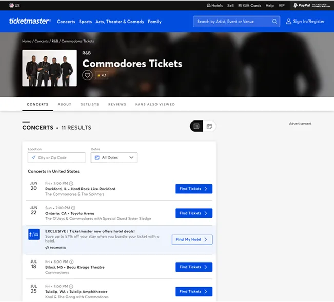
Breaking down the ticket lifecycle (pre-purchase → purchase → post-purchase) helped me isolate pain points at each stage. A competitor analysis (Ticketmaster, AXS, etc.) revealed gaps and opportunities to stand out.
To ground insights in reality, I conducted ethnographic research at venues, observing frustrations like long queues and poor signage. Data confirmed mobile dominance (90% bookings), pushing me to prioritize a mobile-first redesign.
For deeper insights, I documented the full process in a Medium article—covering research, personas, and design decisions.
1. Heuristic Evaluation
Assessed the existing platform using Nielsen’s heuristics, identifying issues like poor navigation, unclear CTAs, and inconsistent feedback. Focused on improving system visibility, error prevention, and user control.
2. Understanding High-Level Process Flow
Mapped the user journey from discovery to post-purchase, identifying drop-off points and opportunities for smoother interactions.
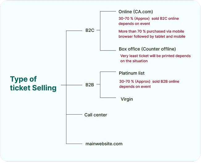
3. Understanding the Ticket Business (Pre-Purchase, Purchase, and Post-Purchase)
4. Competitor Analysis
Studied Ticketmaster, AXS, SeatGeek, and StubHub for seat selection, mobile ticketing, security (CAPTCHA, face recognition), and cross-selling strategies.
5. Ethnographic Study
Observed ticket redemption at venues, noting pain points like long queues, unclear instructions, and user-agent friction.
6. Mobile Usage Statistics
90% of bookings happen on mobile, necessitating a responsive design with fast load times and intuitive navigation.
Further Reading: Medium Article on UX Analysis
For a more in-depth understanding of my methodology and insights, I have written a Medium article detailing the full UX analysis and optimization process for this project. This article covers my approach to user research, including persona development, user journey mapping, and how the insights from my research informed design decisions throughout the project. You can read the full article here.